Free the Map
A map is a visual story of the world. It feeds our imagination and shapes our view of the world. A standard atlas, however, predominantly tells only one story, that of the nation-state. It depicts a world in which people are uniformly packed into national containers, enclosed by borders, and in which migration is often represented as threatening invasion arrows. The book Free the Map, written by Prof Henk van Houtum and designed by De Vormforensen, goes beyond this narrow, state-centric cartography. The book argues for a new cartographic story: a Hermes - the grandson of Atlas and the god of mobility and human connections. To this end, it discusses several visually compelling, alternative cartographic representations of borders and migration.


Free the Map is a call to action. Various artists, designers, and cartographers offer exciting ready-to-use briefings for education and public Maplabs: Tofe AI-Obaidi, Catalogtree, Yishay Garbasz, Henk van Houtum, Susanne Khalil Yusef, Nicolas Lambert, Sarah Mekdjian, Ruben Pater, Philippe Rekacewicz, Malkit Shoshan, Jonas Staal, Irene Straccuzzi, Annelys de Vet, Jasmijn Visser, and Denis Wood. These briefings are included in the final section of the book and are also available for free at this website.
We invite you (tutors, workshop-leaders, teachers) to use our Maplabs freely. To jointly construct a new cartography of the world.

Let's free the map from its territorial trap!

Make a personal map of your migration & design a flag for this route

Annelys de Vet

A map is a coded compact representation of reality, and coding means making choices, classifying, and simplifying many layers of information. Any choice that is made in the context of the territories shown is political. As such, a map can never be neutral. Considering that maps play a regular role in the discourse that shapes our world, the making of them should be constantly critically examined. Which authority draws the lines? What really defines our borders? Do geographic boundaries limit our territories, or are they specified by the speed of the internet, tax havens, war, piracy, Google, Ikea, or our holiday destinations?

The methodology of subjective mapping opposes the top-down, seemingly objective cartography position. Instead, it aims to counterpose the purported neutrality through engaged mapping projects. To this end, it proposes a bottom-up approach of mapmaking by inhabitants (subjects) themselves, which allows them to question dominant ways of representing territories and demystifies standard methods of mapmaking. In so doing, the subjective Atlases offer a platform for collective visual dialogue to challenge the social, political, and cultural circumstances of our day-to-day realities, which potentially contributes to more pluralistic and sensitive territorial identifications and experiences. 

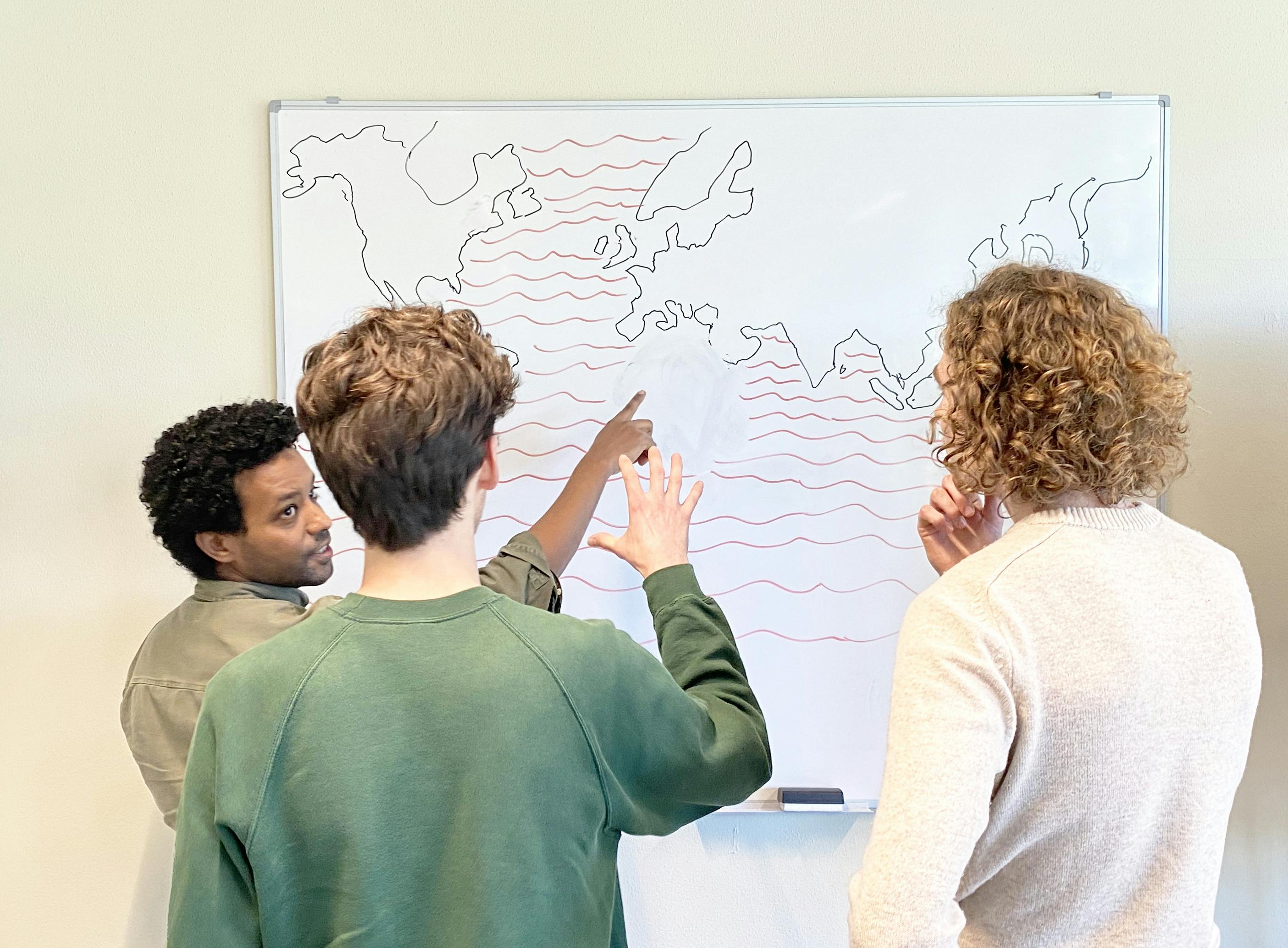
Draw your own ‘migration route’

Given the above aim and perspective, participants, i.e., people with a migration background, for which this briefing is principally intended, are invited to map their migration route from their own political, critical, romantic, negative, or positive experiences. What participants consider as a route is up to them. And it is up to the participants to visualize what they feel comfortable sharing as long as it fits on one A3 paper.

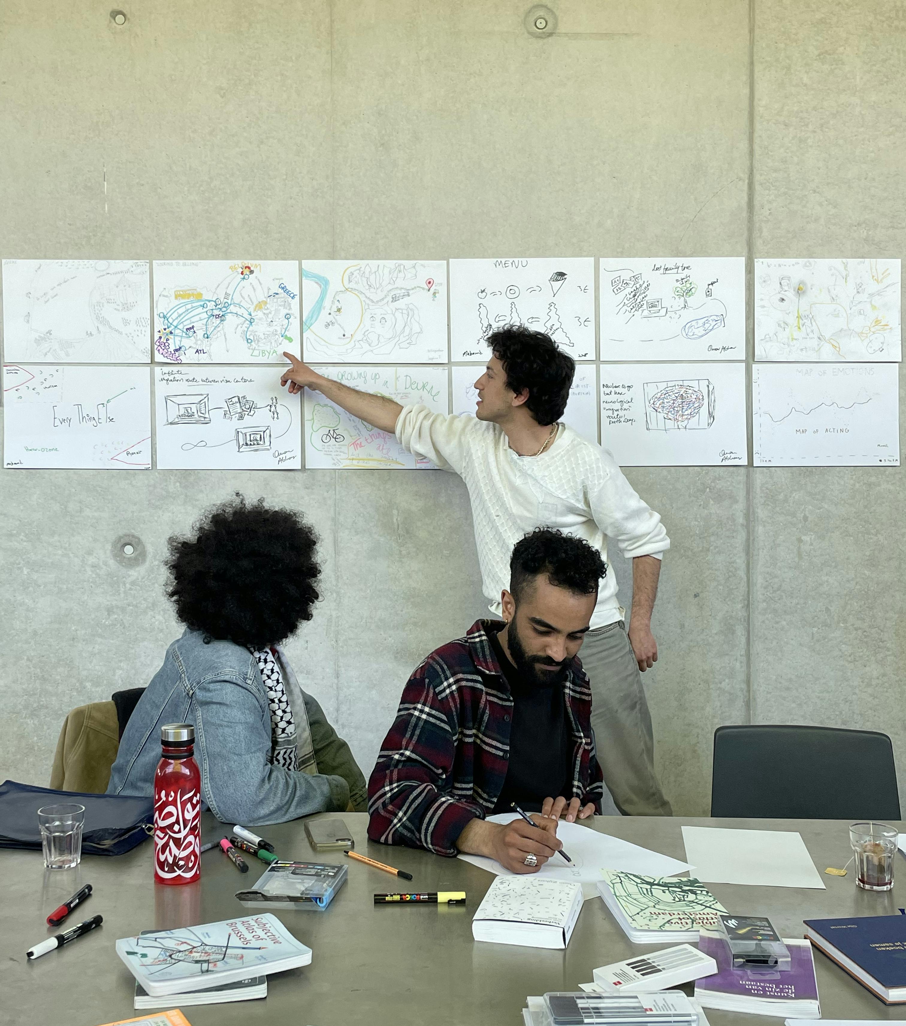
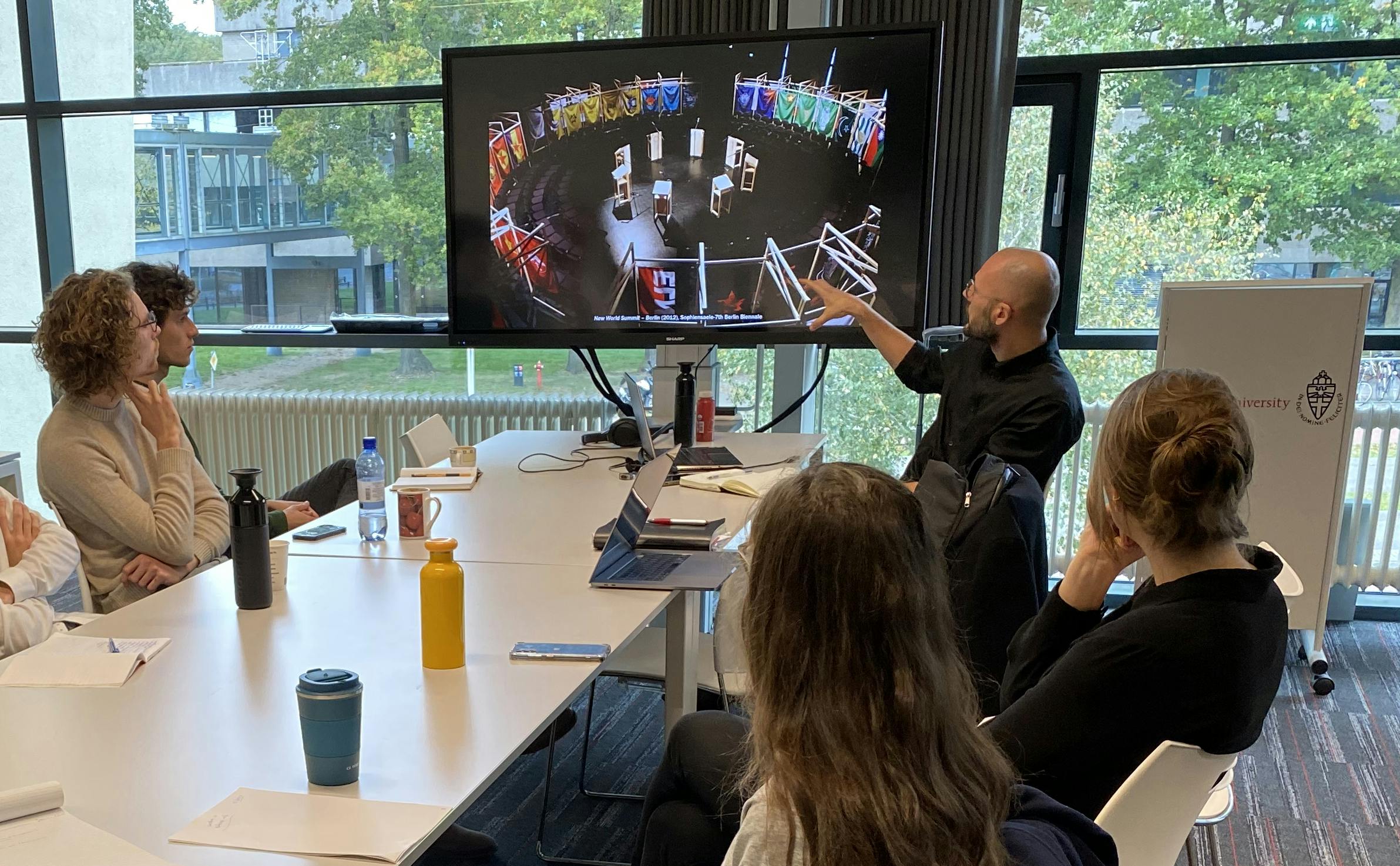
Discussing the migration routes, Maplab by Annelys de Vet, 2023

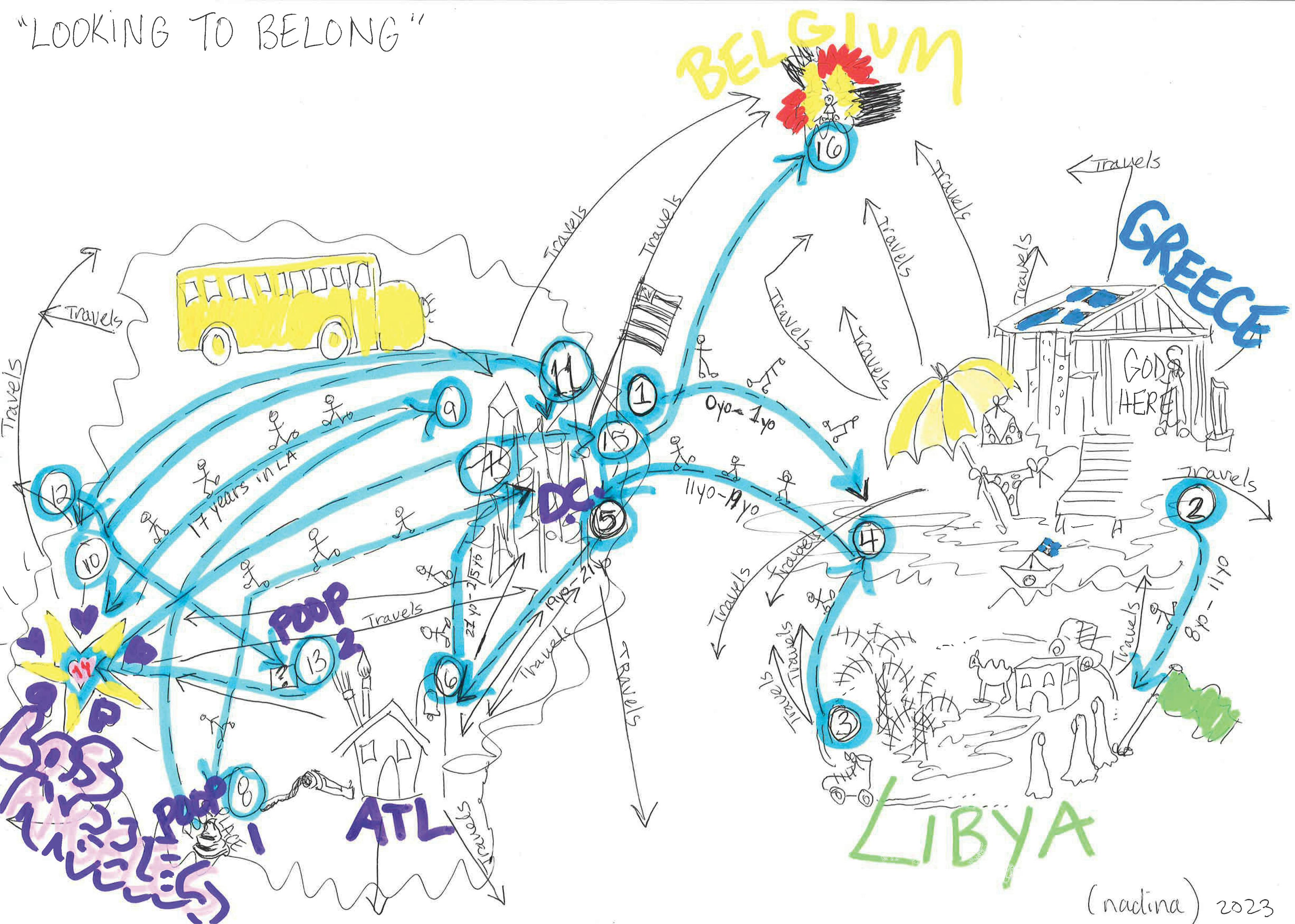
Looking to belong’, Nadina Embrey, 2023

The flag is the political symbol par excellence. It is a sign of power used to claim territory and to visualize the imagined homogeneity of a country. In that sense, it is the equivalent of the state borderlines on the standard political map. In reality, however, countries are much more diverse due to cross-border mobilities and influences than the top-down flag suggests. To deconstruct the singular meaning of flags, and challenge their top-down uniformalization, participants are invited to design their own flag beyond predefined borders. What kind of flag could represent the crossing of several states, and how can a flag be personal instead of universal?
To put it in a question:

If your migration route would be a flag, how would you then visualize this? And what title would you give your flag?

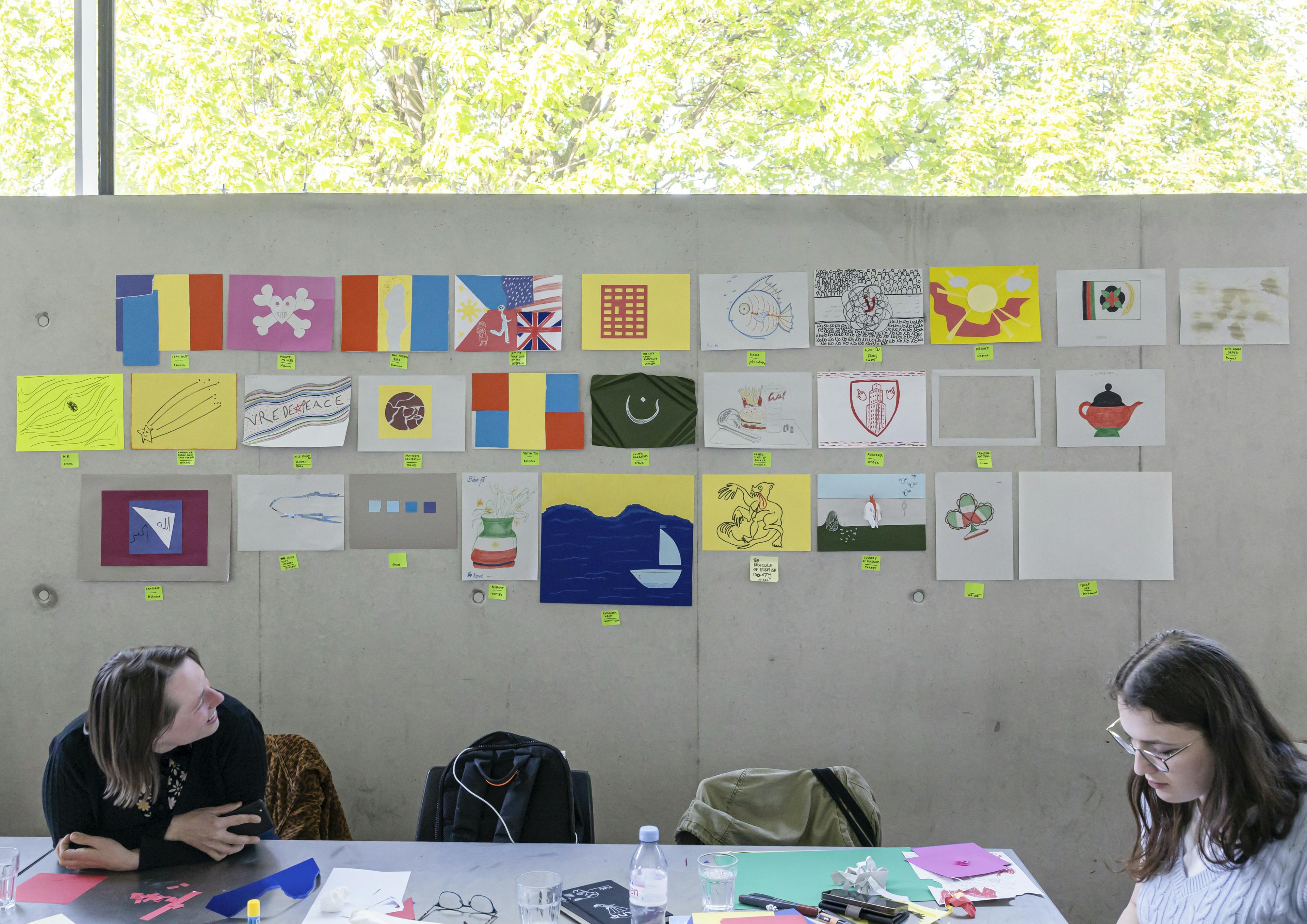
Impressions of the alternative flags, Maplab by Annelys de Vet, 2023

There is no such thing as a vague map

Catalogtree

It is fairly easy to design a map based on precise information – but most of the information we have to deal with is imprecise, incomplete, or just plainly wrong. Once put on a map, it may look reliable, but it fails to communicate its dubious sources.

In his book Cosmographia (1524), Peter Apian cites (and illustrates) Claudius Ptolemy and his definition of chorography and geography. Geography entails the study of the entire world, whereas chorography is the study and mapping of its smaller parts — provinces, regions, cities, or ports. Chorography excels in details, but it lacks overview. Geography, in turn, shows the whole but has to abstract all details at bigger scales. When maps are described verbally, this problem shifts: even the vaguest description of a territory (“the rebels came from the north”) sounds exact but will produce a completely different map for each person once drawn.

How can vagueness be incorporated into cartography?

Based on this question, the following assignments could be posed to participants:


Describe a territory of your choice in 200 words (max.).
Collect all descriptions and distribute these randomly among the participants.

• •
Draw a map based on the description you have received.

Born into the world, not here or there

Denis Wood

Why not use the map to show the situation as it really is?

I grew up in Cleveland on its near west side in the 1950s. My friends and classmates came from everywhere, or near enough everywhere that it didn’t matter. They came from Albania and the American South and Lithuania and Hungary and Puerto Rico and Italy and Serbia. I had a classmate who was Romani and one who was hillbilly, and one who was Polish. I was a Wood out of a Manning and we probably didn’t belong in the Projects, but just like the rest, there we were; and it seemed the most natural thing in the world to be all living together from all over the place. Okay, not all over the place — I mean, not Asia — but over enough of the world that in my elementary-school-age mind, things like borders, like migration, were ludicrous: people from everywhere lived everywhere! They just did …

Or, as William Saroyan put it,
“Birth is into the world, not into a town.”

The thing something like one of those Frontex maps elides, ignores, is what a colossal assemblage of various peoples the European Union is. You’ve got all these arrows coming from various places attacking a uniform light-blue blob like it was a single coherent thing. I mean, the EU has 24 official languages, and that’s not counting the speakers of Catalan, Frisian, Yiddish, Limburgish, Faroese, Sorbian, Welsh, Basque, and the list doesn’t stop. Forty-five million Europeans speak non-Indo-European languages! And the place is stuffed with Arabic speakers. I mean, seven million of them live there! So, the idea that all these Africans and people from the Middle East are invading this immaculate European thing… it’s ridiculous.

And then the numbers!? One year, that huge arrow was supposed to represent 330.000 people attacking Europe, whose population is around 741 million. That is, it was supposed to represent four-hundredths of one percent of the continent’s population. If we restrict ourselves to the EU’s population of 448 million, the ‘threat’ was coming from people barely seven-hundredths of one percent of the EU. So, this arrow should be minuscule, barely visible on the page.

So, here’s an idea:

why not use the map to show the situation as it really is? Represent Europe as the seething mass it is of peoples who’ve been migrating there for centuries — literally! — as an insane quilt of many colors. And drop the borders, since they’re scarcely there in the Schengen area anyway, but make sure you’ve got the millions and millions of Roma and Travelers on the map. I mean, this is the tricky part: representing Europe as the bewildering collage of disparate peoples that it is. And then the threat dwindles to that spaghetti strand, that strand of spaghettini, of vermicelli. Such a map won’t get anybody elected, especially if the strand is splintered as it should be to reflect the many points of entry, a dribble here, a dribble there, but it won’t keep anybody from getting into heaven either.

You know, we talk about migration like we know what it is. We talk about seals migrating or zebras or birds, the magnolia warbler migrating from Mesoamerica to the boreal forest of Canada and back again, and the golden-winged warblers flitting from Colombia to Tennessee. But isn’t this just Saroyan’s truth again? Weren’t the warblers born into the world, not here or there? I was studying the kids, the children, of a housing project, a caserio in Barranquitas, Puerto Rico, and mapped them at three different times of the day. At 1:00 a.m., they were all in the 11 buildings of the caserio, snug in their beds. At 9:00 a.m., most of them had disappeared, the caserio buildings being occupied by only the really little kids and the truants; the rest had … migrated… to school. At 5:00 p.m., they were all over the caserio, hanging out, playing, running errands.

Where were they?

Where are the warblers?

Where are the people newly arrived in Europe?

They’re where they belong: in the world.

The world we have never seen

Henk van Houtum

The lie of the line. Mapping the world of paper borders. 

The standard map of the world divided into uniformly designed border lines between countries suggests equality between them, but that is a misperception. All borders are unequal. Not only are the borders of countries physically guarded in different and often asymmetrical ways, but the countries also differ significantly when it comes to their paper borders: visas. These paper borders are invisible on the typical world map as well as in the material landscape but are the most impactful and globally divisive borders. If you are born in, say, -Afghanistan or Syria, you can travel without a visa to only roughly 13% of the world’s destinations, whereas if you are born in, say, Japan or the -Netherlands, it is more than 80%. Moreover, in many cases the people with the least powerful passports do not get a visa even if they must flee, leading to hazardous journeys. These differences between passport privileges are not on the map. 

What would the world map look like if, instead of the borderlines, we used visa borders as a starting point?

Where is your country on the map?

The typical political map of the world resembles a jigsaw puzzle. Every country has its own place. Very orderly. But appearances are deceptive. Because a country is not a puzzle piece. If you know that your country has historically and geographically many global interdependencies, that your country’s laws are to a large extent international co-fabrications, that your country’s border policies extend far beyond the border lines on the map, that your country’s economy is significantly influenced by globally operating multinationals, that your country’s culture is a dynamic configuration of various local and international influences, and that your country’s borders are crossed every day by the global movement of money, goods, information, and people, the question is then: 

Where is your country really located on the world map? Where do you draw the line?

Humans, not arrows.

Migration is often depicted on a map as an arrow from country A to country B. However, we know from border and migration studies that migration is anything but a straight line, especially when it comes to undocumented migration. The journey often begins earlier than the arrow suggests, takes longer, has many difficulties, hazards, unexpected stops, and usually does not end once the migrant arrives in country B. Moreover, related to population numbers, the arrow is often depicted far too large and not shown in relation to other mobilities. Most objectionable, however, is that the arrow suggests an enemy invasion, as seen in military maps. The faceless, massive arrow is primarily the perspective of the state. It emphasizes the imagined homogeneity of the nation and the exceptionality of the border crossing of non-natives. In short, an arrow suppresses a more inclusive and human perspective on migration. 

How would you depict migration on a map without using an arrow?

Climate justice

Irene Straccuzi

We are used to looking at political maps of the world in which borders between countries are represented as continuous lines. The precision and scientificity of this visualization perpetuate the imagination that clear divisions exist between one country and the next. However, this visual language excludes the uncertainties and complexities of daily global border relations and connections while assuming homogeneity and simplicity.
Climate change is one of the pressing transborder issues where the narrowness of this linear thinking becomes vividly manifest. Climate change is an urgent global challenge with long-term implications for the sustainable development of all countries. It is impossible to contain the impact of climate change within state borders. Moreover, there is an enormous inequality in the sharing and distribution of global emissions. Many of the people and nations most affected by climate change are among the least responsible for it. The most affluent countries, firms, and people have a far larger ecological footprint in terms of extraction of natural resources, consumption and production patterns, and waste production, with consequences for the entire planet.

How would you design a map that explores the global impact of climate change across state borderlines while stressing the inequalities in ecological footprint between different countries, firms, and people?

How can this map promote a just and fair redistribution of climate change burdens and responsibilities?


Time-space relationships

Jasmijn Visser

The futurist poet Velimir Khlebnikov (1885-1922) grew up in Kalmykia, a region in Russia where the nomadic Kalmyk live. The Buddhist notion of time as intervals in Kalmyk culture highly influenced his writings. In his unfinished ‘Tables of Destiny’, he stated that every geopolitical event or battle was juxtaposed with a ‘counter-battle.’ His idea was that events and battles repeat themselves at certain intervals; if one could find the right algorithms of these intervals, predicting future events would be possible, and wars could be prevented.

As one of the founders of Futurism, he was constantly searching for a future in which enlightened humans could live in harmony with themselves and nature. To this end, he proposed to find a universal language of numbers and signs. Khlebnikov was elected by the futurists as the first ‘President of Planet Earth’ in 1915.

Following the nomadic Kalmyk, Khlebnikov lived like a nomad, leaving sketches and poems in pillowcases at friends’ houses. His pillowcase sketches reveal designs for maps that show events as chains, almost spaceships-like schematics of time-space relationships.

In 1922, he died of the consequences of exhaustion and starvation. On his gravestone, it says: Here lies the first President of Planet Earth.

A map is always related to a temporal dimension. Yet, in traditional maps, the spatial dimension dominates. The temporal dimension is often merely marked by means of a date or an arrow (showing a movement in time).

Following Khlebnikov’s footsteps, design a contemporary format for a map in which time and space become equal carriers of the phenomenon or event (such as a conflict, a border, or migration) that is depicted. While creating this depiction, consider the challenges Khlebnikov faced before you:

How to show interrelated phenomena and events?

How to create a map that is universally understood?

And how to depict power relations?

Mapping stateless worldings

Jonas Staal

We tend to look at maps based on a statist — colonial — world-view. The world we know is a world of countries, of nationstates, that suggest a unity between territory, culture, and population. However, borders are not natural; they are created by people and, therefore, can also be changed by people. What is more, there are many more worlds within our world. Stateless nations such as Oromia, Azawad, Somaliland, Kurdistan, Palestine, or Tamil Eelam are not visible on maps, but they most certainly exist, and they continue to struggle for their existence. There are other stateless territories invisible on the maps as well: trillion-dollar companies like Amazon or Facebook operate as transnational corporate states but are not visibilized as such.

How — and with whom — would you map the stateless worlds within our world, whether it is the stateless nations of peoples or the corporate states of transnational capital?

Identification 

For which stateless entities do you have a interest?
What precarious stateless actors will benefit from mapping, and which stateless actors will be further precarized when mapped? What are their stakes in the mapping process?
What powerful stateless entities do not wish to be map-ped? What would be the collective benefit of mapping these entities?

Visualization

What traces does your stateless entity leave behind?
Are they ideological traces? Are they migratory traces?
Financial traces? Legal traces?
Can you find existing indexes to support your mapping?
What is missing in their mapping that you think should be added?
What is the best form to publish your mapping? Is it an alternative globe? A printed map? A book? A website? A phone application? A social media account? A mural?
A procession?

Reclaiming absence

Malkit Shoshan

As a child, I loved maps. I was enchanted by them. Their ability to condense the entire world into a handheld format, bridging the gap between distant places and cultures, filled me with awe. Yet, as I grew older, I began to question the nature of these maps. I came to realize that while they were shaped by the scientific tools of the modern world, they were also subjective human interpretations. They served not only to unify our understanding of the world in a reductive way but also to delineate and define our relationships with our environment, often along social, economic, racial, religious, and ideological lines.

Maps are instruments of exclusion and inclusion, wielding immense cultural power. In Western societies, we learn to read and reproduce maps from an early age. I vividly recall tracing the borders of my country as effortlessly as I learned to read and write. However, during my architecture studies, I started to challenge these lines and question their origins and consequences on people’s lives and livelihoods. It became apparent to me that political borders are fictitious constructs, with little consideration for the diverse constituents and territories they encompass.

The borders of my own country, Israel, have a complex and ever-changing history. Shaped by wars, exiles, conquests, international treaties, and peace agreements, they are marred by violence, resulting in exclusion, colonization, oppression, erasure of culture, and violations of rights. These borders not only exclude certain cultures and religions but also reshape the natural environment. Within Israel, native plants and animals have been replaced with those associated with a preferred culture. Enclosure and colonization, both of land and people, are consolidated through the abstraction of maps, enabling the strategic imposition of new narratives, land and resource management, transformation, renaming, and alteration of appearances.

Yet, despite the erasure caused by colonization processes, fragments of cultures, languages, spaces, and diverse forms of knowledge persist. Something always remains behind, challenging the dominant narratives. Growing up, I encountered ghostly neighborhoods on my way to school, a haunting reminder of past lives that were not discussed openly. The ruins — parts of walls, pavements, and domes composed of beautiful, artisan-crafted stones that contrasted with our modern concrete homes, silently bore witness to a hidden truth, casting doubt on our collective narrative. In my Atlas, I put two stories side by side — the story of Israel, the country I was born into, and the story of Palestine, the people my country violently displaced.

Maps, however, also have the potential to help us unlearn and contest prevailing narratives of power, be they national, colonialist, or humanistic. We can draw maps anew that tell different stories, bringing to light different suppressed realities and capturing our experiences, observations, relations, and environments through intuitive or critical lenses. 

I invite you to create an intuitive map of your environment, both at a small and large scale, incorporating the elements and forms of life that capture your attention. You may include names, official monuments, significant spaces, or any other elements that resonate with you. Compare your map with an official map and identify what is missing.

Begin to tell the stories of the absent elements, shedding light on their significance and reclaiming their place within the narrative of your surroundings.

Borders between social classes

Nicolas Lambert

Worldwide, there are an estimated 300 million international migrants, to which the number of internally displaced persons should be added. Mobility is complex and does not follow the same spatial logic globally. Coming from an affluent country, crossing a border can be extremely easy, but coming from a less affluent one, it can be extremely perilous, even lethal. This is the point we want to explore here.

On maps, the border is often represented as a line separating two countries. This line has no direction. It has no orientation. Whether you look at it from one side or the other on a map, it looks the same — a thicker or thinner line, possibly dotted. Yet borders are not symmetrical. They do not give you the same rights to mobility, depending on whether you are on one side or the other and depending on whether you live in an affluent country or a less affluent one. Indeed, far from being democratic and consensual, borders are the site of a balance of power between those who have the freedom to move safely and others who are constrained to immobility or to perilous and dangerous movements. Rich and poor, two worlds facing each other. The border can be seen as a battlefield that goes far beyond the geographical dimension of a simple line. The border is pixelated, reticular, imperialist, and dominated by one side. The question raised here, therefore, has a dual objective. On the one hand, describing the borders in terms of class struggle, and on the other, to graphically represent these asymmetries. Linear representation is not necessarily the solution to this challenge.

If borders are the place of confrontation between social classes, how can they be represented on a map?

The border is anywhere

Philippe Rekacewicz

The cartographic symbolization of borders between states or large regions by simple lines was undoubtedly the easiest solution for identifying areas and territories subject to the same system of sovereignty and specific jurisdiction. It could be deduced from this that the same administrative and legal systems did not apply on either side of this line known as ‘borders’. It is this simplistic image that is presented to our ingenuous eyes: a set of closed lines and colored surfaces. This is the drawn rendition of reality, but in reality itself the social and political territorial practices in these supposedly clearly delineated spaces are infinitely more complex and diverse, not to say completely intertwined.

In ancient times, in Central Asia, for example, on the vast steppes, seeing the enemy arriving hundreds of kilometers away, when they had not yet physically penetrated the land to be conquered, meant that it was already too late: they crossed the border by anticipation, a sort of proxy crossing, then the border was no longer the limit but the visible landscape, in other words an entire territory. Moreover, today, through bilateral or multilateral agreements, European countries are exporting their own legal and policing practices far, far away from what we consider to be Europe’s ‘borders’ (if there is such a thing...). This is a transfer of police powers designed to control the EU’s ‘borders,’ which are already thousands of kilometers away from ‘entry into the EU’.

In this way, a village in Burkina Faso or Mali, where the authorities stop travelers and herd them into closed or semi-enclosed camps, effectively becomes the EU’s border. In the same way, the irregular migrant who has no residence permit and is arrested in Berlin or Paris and transferred to prison for the simple reason that he or she has exercised his or her legitimate fundamental right to freedom of movement (article 13 of the Declaration of Human Rights), finds himself or herself, in the very heart of the European continent, ‘on the other side of the border’.

The concept of a line to qualify a border has come a long way. It is no longer a valid or relevant approach to defining the place, the limit that generally marks a change of sovereignty or jurisdiction, if it ever was. The border has completely melted into space; the territory itself has become the border, which has become fragmented, dislocated, and pixelated (to use Didier Bigo and Elspeth Guild’s expression). From being a line, the border has become a point or a surface. As police and administrative checks are carried out, and surveillance resources are stepped up to track down all those who fail to meet the requirements of ever more restrictive laws, the border is multiplied and occupies the land. Borders are no longer crossed; they are now everywhere…

If the border is everything but a line, what would it be? And why?

Maps without legends

Ruben Pater

Maps often assume a use for orientation and navigation in cartesian space (x,y,z), which relates to the Western and capitalist idea that land can be owned, measured, and divided. However, many indigenous people believe land cannot be owned because it belongs to forefathers, future generations, and non-humans alike, who have just as much right to the land as its current owners/users. Therefore, many indigenous maps not only include physical spaces but also spiritual spaces, historic events, and activities of past generations.

How would you create a map or adapt an existing map to be more inclusive to non-humans and past generations, from your personal perspective and need?

Countermapping lethal and environmentally damaging policies

Sarah Mekdjian

My concern is twofold. 

• 
How to forensically counter-map lethal immigration policies in a way that is useful in court? What civil disobedient forensic cartographic practices could ascertain such illegal practices while still acting within the confines of law? These questions also arise in the context of climate litigation. 

• •
Another related aspect is questioning the notion of legal and scientific expertise: how to produce maps that demonstrate illegality and damages by opening up the circle of specialists in producing maps (scientists, lawyers) to all people involved, the civil parties whose aim is also to respond to these violations?

If you only have your memories left

Susanne Khalil Yusef

In one of my artworks, I show a map with the locations of 418 Palestinian villages that no longer exist. After the people were driven out, the villages were largely buried and planted with trees or destroyed. Here and there, you can still see towers of buildings sticking out of the ground. On current maps, there is no trace of them anymore. At an exhibition of mine, a man came by who recognized one of the villages. He told me that that was the village from which his family had fled and that he would return as soon as he had the chance. It was a great shock when it became clear to him that the village no longer existed. Afterward, I met an Israeli woman who had played on one of the ruins of the villages as a child.

Are there places in your life that you would rather forget and bury?What would a map look like that included only these places? And what would a map look like with places you would love to return to?

Put your route to school and your imagination on the map

Tofe Al-Obaidi

My goal is to humanize the map beyond the mere abstract and lifeless representation of the world by radically opening up to the inclusion of experiences and imaginations of people. I am particularly interested in understanding how children who have not yet had (much) topography lessons experience space, the borders in space, their movements in space, and the imaginations of the unknown. Creating an experience-map can, for instance, be done with migrant children, who could be asked to draw on their migration experiences. In addition to extra measures to create a safe(r) space, this may require special training in dealing with potential traumas that the drawing assignment may evoke. For this Maplab I have chosen to map the travel and border experience of a daily route of young children. Children spend most of their time at home or school. These are the places where most of the memories are created. But also where the first boundaries arise. Especially when it comes to the apparently mundane, routine spatial actions, much can be learned about the internal boundaries that have been learned, internalized, and normalized and the fantasies and dreams of and possible concerns about the world outside those learned boundaries. Are they allowed to go anywhere? And how do they depict the world beyond the bounds of the known? Is that a dreamland? Do dragons or other fantasy creatures live there?

How do children, who have hardly had any topography yet, look at their environment?

How do they map their world, its boundaries, and the world beyond?

The idea is that children make a map of the way from home to school. To this end, the children are first asked to draw what is present in the streetscape (roads, buildings, trees). Then, they are asked to indicate where they were allowed to go. Where are the boundaries? And lastly, they are asked to imagine and picture what could be behind these boundaries. What kind of world lies behind the known roads?


Draw (with a marker) your bedroom on an A3 paper.
Place furniture in the bedroom using cut-out shapes.
What floor is your bedroom on (write down a number)?
How do you walk/bike from your home to school? 

• •
Indicate on the map where you are allowed to go.

• • •
Draw (with one or more markers) on or next to the map what you think is or could be there?


Mapping administrative violence against LGBTQ+ migrants

Yishay Garbasz

Once migrants have passed the imaginary borderline, one would hope to think that the law is the same for everyone. But this could not be further from the truth. The bordering does not stop at the borderline. Systemic discrimination and one of its tools, micro-aggression (perhaps better termed cumulative aggression), by the authorities against migrants and others who do not fit the norm, is pervasive. Equality before the law is being violated in multiple parts of the world. The institutional racism of the Dutch tax authorities towards persons with a migration background who were systematically wrongly suspected of fraud, which led to the childcare benefits scandal (‘Toeslagenschandaal’), is a prime and recent example. Or take the racial profiling and microaggression in security screenings at airports. Or look at how, in Tunisia, black Africans are being violently expelled. Or think of the police racism in the banlieues of Paris or the inhumane labor conditions for the migrants who built the stadiums in Qatar. And what to think of the detention of undocumented foreigners, which de facto turns an administrative issue into a crime punished with incarceration.

This mapping proposition concerns the discriminatory governmentalities within the judicial system and public administrations. And within that, I am zooming in on the inequality in treatment and construction of invisible gates that especially disadvantage LGBTQ+ migrants.

The proposal is to make an individual experience-map of a certain incident experienced by an LGBTQ+ migrant, guided by the mapping of the oppositional and supportive elements.

The result will be a collective of critical counter-maps of discriminative and possibly violent geographies made by those whose voices and perspectives are often not included in the dominant maps.

The incident can be any kind of administrative violence that the participant has experienced. The mapping could include three perspectives: incident, opposition and social and personal resiliency.

Incident mapped

Portray (with a drawing, collage, or word map): What is the incident? Where and when did it happen? What kind of discrimination did you face during the incident? What unconscious biases did you face? What was your experience, feeling, and reaction when it happened? Did it happen to others as well that you know of?

Opposition mapped

Map with a drawing, a collage, or a word map in any language the type of biases you faced. What are the material differences and (educational or background) privileges that may have created these unconscious biases and power imbalances? Is there anybody that checks on them, like the media, colleagues, or other authorities? Or do they wield power without any checks or balances? What is the web of connections and interactions that the discriminating officer is entrenched in? See if participants can help each other from their own or their community’s concrete experiences to form this.

Social and personal resiliency mapped

Portray (with a drawing, collage, or word map): Who are the people that are or where in your life that give you strength to help build resilience to deal with the incident? Family, chosen family, friends, social centers, sports teams, NGO activist groups, anarchist collectives, etc. What kind of resources and connections can you muster from the outside to help you? Personal resiliency can be any kind of traits that helps you survive. It can be stubbornness. It can be systemic intelligence. It can be emotional intelligence. The ability to process respectfully is a survival method.

The goal is to make the invisible visible.

While administrative violence leaves no visible scars, counter-mapping can make this violence visible, and perhaps a way to create understanding.